
Hi all
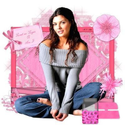
I've written another tutorial. So basically without further ado here it all is I will attach a couple of results as I have used xero porcelain on one this is not necessary at all
thanks for looking
Sweet as Sugar
This tutorial was written by Michelle Mills on 9th November 2008. Any resemblance to any other tutorial is purely coincidental. I claim all rights to this tutorial. Your results of this tutorial you are free to do with as you wish. Please respect the TOU of the owner of the scrap kit.
This tutorial assumes you have a working knowledge of Paint shop Pro.
The results of this tutorial were done in Paint shop Pro Ultimate x2.
Hugs Michelle
Supplies
I have used a mask sg_stencilled-floral-diamond this was sent through a group I do not have the details of where it came from. You need a tube of choice and a font of choice I used Chuzzelwit SF and I have used a beautiful scrap kit called Sugar N Spice by Stacey at www.snmcreationz.blogspot.com/ and can be purchased at Sweet N Sassy www.sweetnsassydigiscrappers.com/store/ A visit to these sites will not be a disappointment.
Thanks for a beautiful kit to work with Stacey.This tutorial assumes you have a working knowledge of Paint shop Pro.
The results of this tutorial were done in Paint shop Pro Ultimate x2.
Hugs Michelle
Supplies
I have used a mask sg_stencilled-floral-diamond this was sent through a group I do not have the details of where it came from. You need a tube of choice and a font of choice I used Chuzzelwit SF and I have used a beautiful scrap kit called Sugar N Spice by Stacey at www.snmcreationz.blogspot.com/ and can be purchased at Sweet N Sassy www.sweetnsassydigiscrappers.com/store/ A visit to these sites will not be a disappointment.
Please note I try to always give credit where credit is due. I always try to be copyright compliant but I receive a lot of Graphics and Tubes through groups and if I haven’t given proper credit please let me know so I can give proper credit or if you wish and it’s your to remove it.
Don’t forget to save often...
Remember this is your tag... Create have fun...
Open everything you need in paint shop and create a new 600x600 transparent image
Open paper 5 copy and paste as new layer and then go to layer>New mask > from image select your mask from drop down list and source luminance and I had to invert with my mask.
Merge group and then add a drop shadow I used V&H 1, Opacity 30, and blur 1, colour black. Add new raster and select all and then add paper 4 and do the same as before with your mask. After you have added drop shadow on this mask layer free rotate right 45 degrees and then move this mask layer below the first mask layer.
Open your ribbon frame and then copy and paste as new layer make sure it’s on the top layer. Resize to 70%. Don’t forget to adjust and sharpen once. Add drop shadow I used the same throughout.
I then added my Daisy Flower and resized to 20% sharpened and moved to right corner of frame I added a drop shadow the same throughout and then duplicated flower layer and free rotated 45 degrees. I then opened Pink flower 1 and copy and paste as new layer resized to 20% adjusted sharpened and then added drop shadow and moved to be in the middle of other flower. See image for placement.
I then opened sugar and spice butterfly and copy and pasted as new layer resized to 15% sharpened and then moved to bottom left of frame I added a drop shadow. Free rotate 25 degrees to the left and then I then duplicated the layer twice and moved each a little down. See image for placement.
Now open and add your tube and place where you think best as mine is quite a large and I left it where it automatically place it..Add your drop shadow
I now opened and copy paste as new layer the journaling box and then resized to 30% adjusted sharpness and added drop shadow. I moved it to top left corner and put it under the tube. See image for placement.
Add any text you like.
I at this point decided to extend canvas from 600x600 to 650x650 do this by image>canvas size and just changing the width and height and make sure placement is middle.
I then opened and copy and pasted as new layer the handbag and resized to 20% sharpened and added drop shadow... see image for placement.
I then opened and copy and pasted as new layer the pink butterfly. Resized to 20% sharpened and added drop shadow. And moved over the top of handbag handle. See image for placement
Finally I opened and copy and pasted as new layer the flower jar and then resized to 25% adjusted sharpened and added drop shadow and then placed it right at the front on right side. See image for placement.
Add your watermark merge and flatten resize if you like and save you’re done.
Well I hope you enjoyed this tutorial. Remember Save often and remember it’s your tag. Have fun. This is just a guide
Thanks for looking
Hugs Michelle


No comments:
Post a Comment